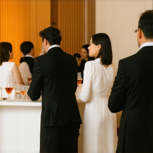
I remember standing in the middle of a high-stakes corporate mixer in a glass-walled atrium, clutching a deck of cards and feeling absolutely invisible. I had been hired to provide entertainment, but the room felt frozen. People weren’t talking; they were awkwardly hovering. I looked down and realized the culprit: the cocktail tables were nearly chest-high, creating a physical barrier that made guests look like they were peeking over a fence just to make eye contact. It was a disaster, and it was entirely because of a furniture choice that seemed ‘standard’ on a rental invoice. We are going to fix that today by looking at why your furniture layout is the secret architect of your event’s social success.
The Invisible Wall Between Your Guests
Early in my career, I made the classic rookie mistake of thinking that ‘more is better.’ I once crammed forty high-top tables into a space meant for twenty, thinking I was being helpful. Instead, I created a maze where guests couldn’t move, and I couldn’t even perform a basic coin vanish because there was no room to breathe. When you pick event furniture rentals that do not block the view, you aren’t just buying chairs; you are designing the flow of human connection. If the tables are too high or too crowded, the ‘experiential networking’ you promised your client becomes a series of polite nods and early exits. This is especially true when you consider the cocktail table strategy for breaking the ice at galas, where the height of the surface dictates how comfortably people can lean in and share a laugh.
Does the table height actually matter that much?
You might be skeptical. After all, it’s just a piece of wood and metal with a cloth over it, right? Wrong. According to research from the Cornell University School of Hotel Administration, the physical environment and layout of a room significantly impact the duration and quality of social interactions in hospitality settings. If a guest feels physically blocked, their brain subconsciously signals them to disengage. I have seen standard event furniture rentals kill the momentum of world-class magicians and CEOs alike simply because the sightlines were ignored. Have you ever felt that awkward ‘social static’ at an event and wondered if it was the crowd or just the room? [image placeholder]
Give Your Guests Permission to Connect
We often focus so much on the menu or the speaker that we forget the silent guest: the furniture. When I started paying attention to how the height secret for successful coin vanishes applies to regular conversation, everything changed. A table that sits at the natural waistline allows for open body language, while a table that is too high forces a defensive, arms-crossed posture. It is about removing the friction. By the time we finish today, you will know exactly how to audit your rental list to ensure your next event is a hub of activity rather than a room of isolated islands.
Stop Hiding Behind Your High-Tops
I once worked a trade show in Las Vegas where the client had ordered these massive, double-wide counters that stood 42 inches high. They looked impressive on the floor plan, but they created a literal canyon between me and the potential leads. I felt like a bank teller, not an entertainer. Halfway through the first day, we pushed those counters to the side and switched to smaller, waist-high rounds. The difference was night and day. People stopped walking past; they leaned in. When you learn how to use party table rentals to create better magic sightlines, you aren’t just helping the magician; you are removing the physical barriers that make guests feel guarded. High tables are great for standing, but if they are too wide, they kill the intimacy required for a real connection. Think of your furniture as a bridge, not a fortress.
Why Texture is the Unsung Hero of Every Table
Most planners look at the color of a linen and stop there. But if you are hosting an event where interaction is the goal, the surface texture is your best friend or your worst enemy. I’ve performed on everything from mirrored glass to rough-hewn barn wood. For anyone doing card work, a slick surface is a nightmare—the cards fly off like they’re on ice. This is why party table rentals and how surface texture affects your card flourishes matter more than you think. Even for non-magicians, a table that is too slippery or too sticky changes how people interact with their environment. A slight grip or a high-quality cloth provides a ‘grounding’ effect, making guests feel more comfortable staying in one spot to chat rather than constantly adjusting their drinks.
Fix Your Trade Show Traffic Before the Doors Open
If your booth is a mess of chairs and heavy desks, you are essentially telling people to keep walking. In the world of high-stakes networking, ‘lead bleed’ happens because of poor spatial geometry. You might be wondering why your trade show booth is being ignored by potential leads, and often the answer is that you’ve blocked the natural entry points. Use your furniture to create a funnel. Place your most engaging elements—whether that’s a demo station or a magician—at the point of least resistance. By applying how to turn a standard cocktail table into a lead magnet, you transform a passive piece of wood into a focal point that captures attention and holds it.
Keep the Momentum Moving with Better Timing
Furniture is only half the battle; the other half is when you use it. I’ve seen beautiful gala dinners grind to a halt because the transition from the cocktail hour to the main room took forty minutes. This ‘dead air’ is where you lose the psychological momentum of the night. You need the timeline management move that stops event flow from stalling to keep the energy high. In my experience, using the sightline fix for event furniture rental layouts at corporate galas ensures that even during transitions, guests have something to look at and someone to talk to. If people have to crane their necks or navigate a labyrinth to move to the next phase, they’ll just head for the exit instead. Aim for a layout that invites movement without creating confusion.Let’s dig deeper into a lie we’ve all been told: that digital is the future of networking. Everyone says an app will solve your engagement problems, but in my experience, technology often builds walls instead of bridges. Why interactive event apps often kill real networking opportunities comes down to the ‘head-down’ effect—guests are so busy checking notifications they miss the actual person standing in front of them. Real connection is a physical, tactile game that happens in the eyes, not on a screen.
Stop relying on apps to do the heavy lifting
I’ve seen this time and again at high-stakes summits. A planner spends thousands on a custom app, only to watch guests use it as a social crutch to avoid making eye contact. If you want people to talk, you have to force them out of their digital shells. According to a study by the Center for Exhibition Industry Research (CEIR), booth staff performance is responsible for 85% of an exhibit’s success, which proves that no amount of software can replace a human being who knows how to work a room. This is why you need the secret to better trade show traffic without paying for a larger booth: it’s about engagement, not square footage. If your staff is hiding behind a counter or your guests are hiding behind an app, the booth has already failed. 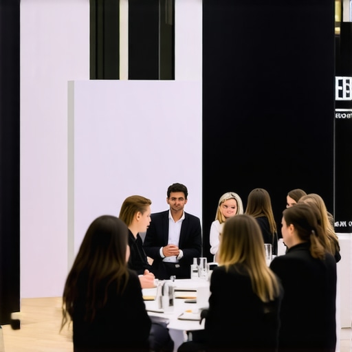
Does a bigger booth actually mean better ROI?
You might think that a massive 40×40 island is the only way to get noticed, but that’s an expensive myth. In fact, a smaller, strategically designed space often performs better because it feels more approachable and intimate. The ‘Oops’ factor I see most often is what I call ‘Zone Collision.’ I’ve seen planners stop putting the magician next to the party photo booth too late—only after the noise of the booth has drowned out the entertainer’s patter and the magic’s impact. You need to separate your high-energy zones to ensure each element can actually do its job. When you learn how to stop lead bleed at your next trade show, you realize that the layout should funnel people toward a conversation, not a loud distraction that makes them want to walk away.
Why your ‘high-energy’ zones are actually clashing
Beyond the floor plan, the timing of your content is the next big hurdle. We’ve been conditioned to think that a 60-minute keynote is the standard for ‘value.’ But in the modern world of shortened attention spans, how shorter corporate keynotes can increase attendee information retention is a game-changer. If you give people a punchy, 20-minute burst of high-value insight, they stay focused and energized. If you drone on for an hour, they start checking their phones (and those networking apps we already discussed). By the way, if you are running a photo booth, you must know how to coordinate your party photo booth with a magic act so they complement each other rather than competing for the crowd’s focus. Creating a synergy between rentals and live talent is the secret sauce of high-end events. Have you ever fallen into the trap of thinking ‘bigger is better’ with your booth or your schedule? Let me know in the comments.Beyond the digital distractions, we need to talk about the physical tools that keep a room alive. I have shifted my entire workflow to favor ‘Spatial Logic’ over ‘Aesthetic Fill’ by using professional-grade mapping software like SketchUp or Allseated. I use these tools specifically to simulate sightlines from the back of the room; if I can’t see the primary engagement zone from 40 feet away, I know the layout is broken. This is crucial because generic event design trends often fail your live entertainer by prioritizing ‘symmetry’ over ‘visibility.’ I’ve seen beautiful ballrooms where the pillars blocked 20% of the audience from seeing the speaker’s hands. By using 3D modeling, you can catch these dead zones before the furniture truck even arrives.
Stop guessing and start mapping with 3D tools
I personally never sign off on a floor plan until I have done a ‘virtual walkthrough’ of the space. In my experience, even a subtle change, like shifting a dance floor rental six feet to the left, can open up a bottleneck that would have killed the room’s energy. This technical approach allows you to implement the tactic to blend magic into modern event design trends without it feeling like an afterthought. You are building the entertainment into the very bones of the room. This is especially important for multi-phase events like a tropical wedding theme, where the transition from ceremony to reception needs to feel like a natural evolution, not a forced march.
How do I keep my event flow sharp over several days?
For multi-day trade shows or corporate summits, the layout shouldn’t be static. I recommend a ‘Daily Flow Audit.’ After the guests leave on Day One, I walk the floor and look for ‘friction marks’—scuff marks on the carpet where people were bunched up, or chairs that have been dragged into odd positions. These are clues. If the jumper rentals are causing a crowd logjam near the food, you move them. According to environmental psychologist Robert Sommer in his work on Personal Space: The Behavioral Basis of Design, physical environments can be ‘sociofugal’ (driving people apart) or ‘sociopetal’ (bringing people together). My goal is to audit the space to ensure it remains sociopetal throughout the entire event.
The future of networking is adaptive and modular
Looking ahead, I predict a massive shift toward modular, ‘smart’ furniture that can be reconfigured in minutes based on real-time traffic data. We are already seeing the beginning of this with sustainable event decor using natural materials for better illusions, which often uses lightweight, mobile elements. This flexibility is what allows for shorter corporate keynotes that get higher ratings, as the room can quickly transition from a formal presentation to an interactive workshop. The ‘fixed’ ballroom is becoming a relic; the future belongs to the agile planner. Try this today: Take a photo from the guest’s eye level at every entrance. If you can’t identify the ‘heart’ of the room within three seconds, move your most engaging piece of furniture immediately.
The Hard-Won Secrets Behind Rooms That Click
After years of watching guests either thrive or wilt based on where I placed a single table, I realized that event design isn’t about filling space; it’s about curated energy. One of the most painful lessons I had to learn was that high-energy attractions need physical and auditory breathing room. I have seen incredible performances fall flat because the problem with jumper rentals and high-energy magic shows is that they compete for the same sensory bandwidth. Similarly, do not let your layout become a game of tug-of-war for your guests’ attention. You must stop putting the magician next to the party photo booth if you want either one to actually deliver a return on your investment. Finally, remember that ‘dead space’ is not a failure—it is a transition zone that allows guests to reset before the next big moment. [image placeholder]
Tools I Use to Eliminate Guest Boredom Before It Starts
When I am planning a high-stakes corporate gathering, I do not rely on a ‘gut feeling.’ I use specific resources to ensure the flow remains sociopetal. My first stop is always 3D mapping software like Allseated or SketchUp, which allows me to visualize the guest’s journey from the front door to the bar. I also keep a copy of Robert Sommer’s Personal Space on my desk to remind me of the biological triggers that make people feel crowded or comfortable. To prevent the dreaded afternoon slump, I advocate for how shorter corporate keynotes prevent post-lunch meeting fatigue by ensuring the physical environment transitions as quickly as the speaker does. I also recommend a quick audit of your stage height—sometimes the venue decoration services hack for better stage sightlines is as simple as adding six inches of riser to ensure the back row feels as included as the VIPs in the front.
Your Next Event Deserves Better Than a Standard Setup
You have the power to transform a sterile rental hall into a living, breathing ecosystem of connection. It starts with the courage to push back against ‘standard’ invoices and ‘traditional’ floor plans. When you stop viewing furniture as a commodity and start seeing it as a strategy, you unlock a level of engagement that no app can replicate. Whether you are searching for the trade show hook that stops walkers in their tracks or just trying to make a wedding feel more intimate, the answer is always found in the physical geometry of the room. Go build something that people will remember long after the linens are folded and the lights are dimmed. Which part of your event floor plan do you think is causing the most ‘friction’ right now? Let me know in the comments below!